Earthquakes Tsunami Correlations
Earthquakes Tsunami Correlations
→Franz AnhäuptlIn this project, developed over the course of the summer semester for the course ‘Programmiertes Entwerfen 2’ (Programmed Design 2), I focused on visualizing data from two datasets to determine possible correlations between earthquakes and tsunamis. The datasets are from Kaggle.com and contain comprehensive information on earthquakes and tsunamis worldwide. My goal was to find out whether tsunamis were triggered by earthquakes and to visually represent these events.
Programmiertes Entwerfen 2
IG2
Prof. Hartmut Bohnacker
Benjamin Thomsen
Data Visualisation
In the following sections, I will discuss the process of the work, address problems and difficulties, and explain my design process for the individual visualizations. Furthermore, this document contains my fully listed stylesheet and all the components used.
Dataset Preparation
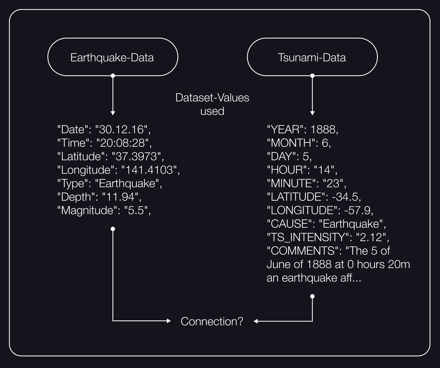
First look at the two datasets with their values for each data point.
My first goal was to understand the dataset and be able to display it mapped on a world map. In doing so, I tried to find comparable values. Both datasets have a latitude and a longitude value, so I used the map function provided by the gmynd library.
In order to determine whether the plotted points correspond to reality, I set a world map as a background layer and then plotted each individual element of the dataset on this two-dimensional map.
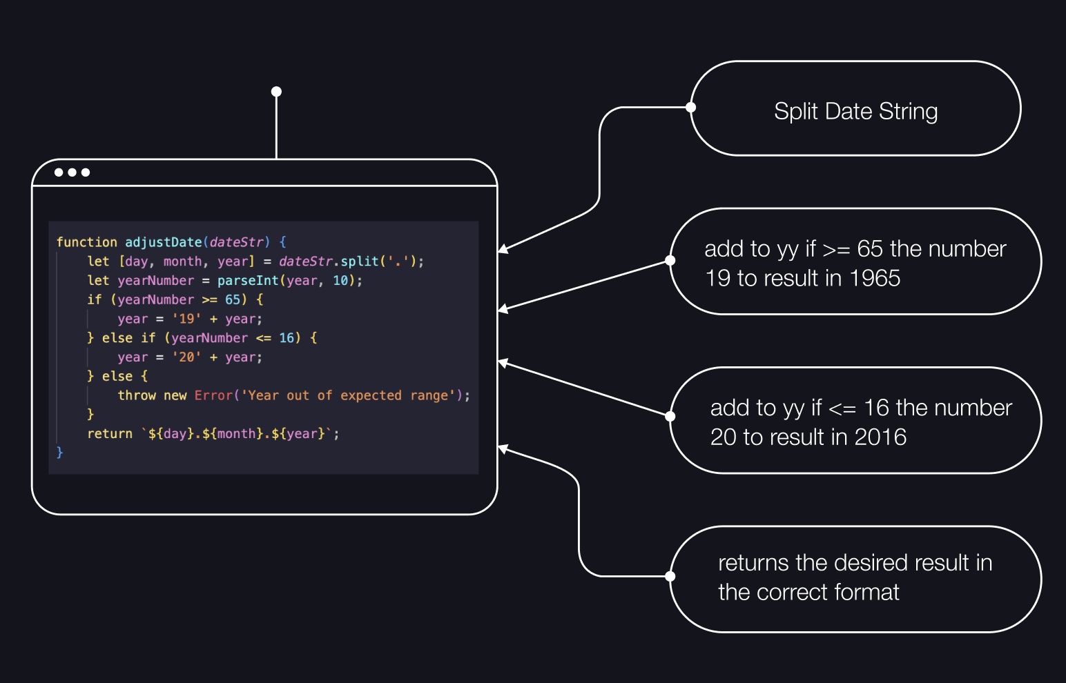
But before I could continue working on the visualization of the individual elements, I formatted both datasets into usable variables. The values ‘Year,’ ‘Month,’ and ‘Day’ in the tsunami dataset were combined into a single variable ‘Date’ and formatted to match the ‘Date’ format in the earthquake dataset (dd.mm.yy).
Some of these solutions on how to consolidate the different time representations are presented here. These significantly simplified the later use of the data and made the precise comparison of data points possible in the first place.
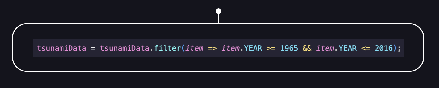
In the following code, the time span of the dataset is reduced because the earthquake dataset only covers the period from 1965 to 2016. The tsunami dataset has a larger range, so it was adjusted to match the same range.
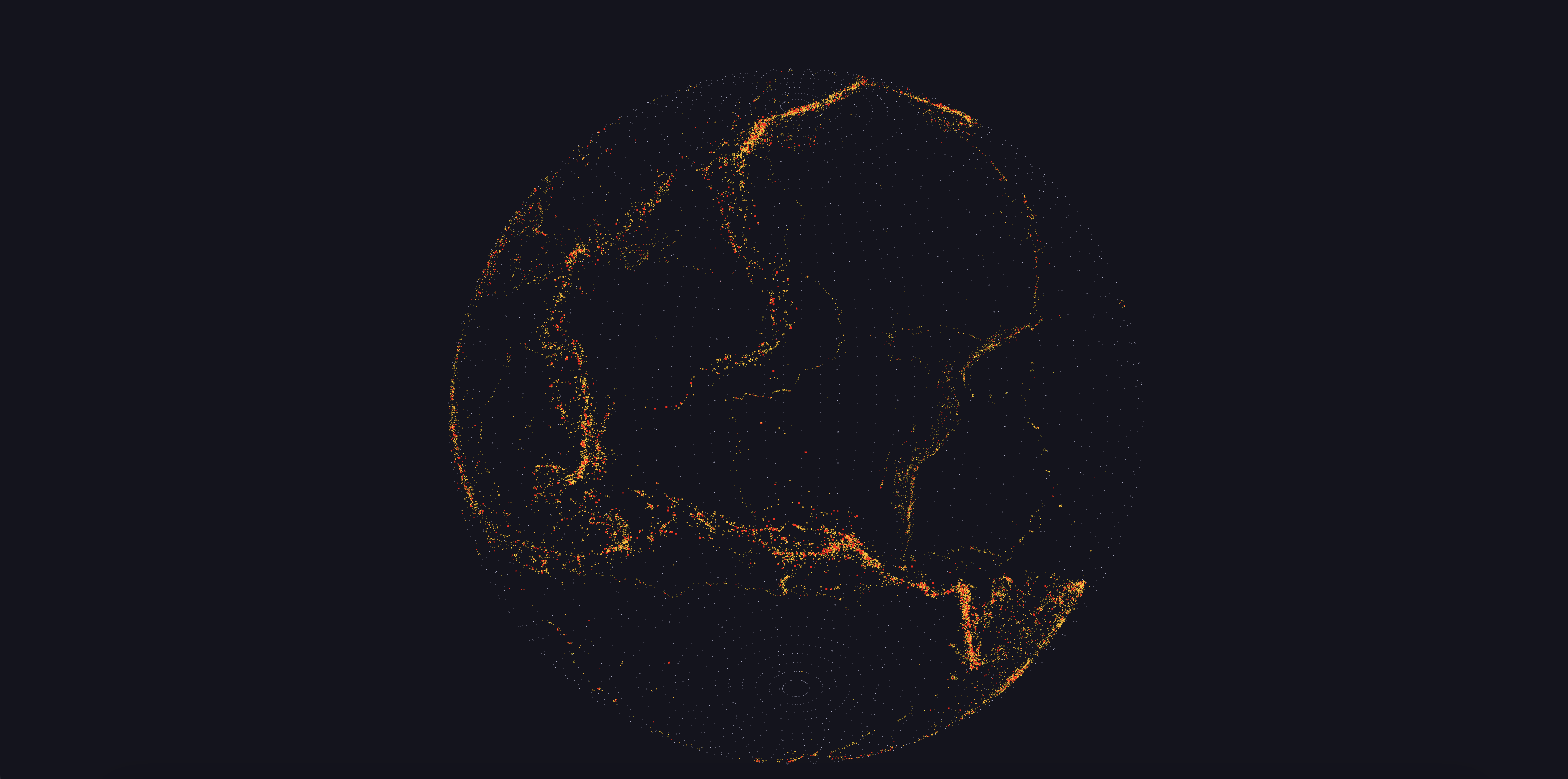
Here you can see this initial approach, where the contours of the tectonic plates are clearly visible. These areas are known for a high density of earthquakes, as significant forces are generated by the collision and sliding of the plates.
To better assign the data points, I early on added a hover effect on the individual element points to display the individual values and better determine whether everything is correctly integrated and functioning.
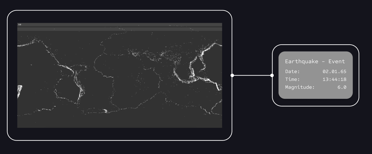
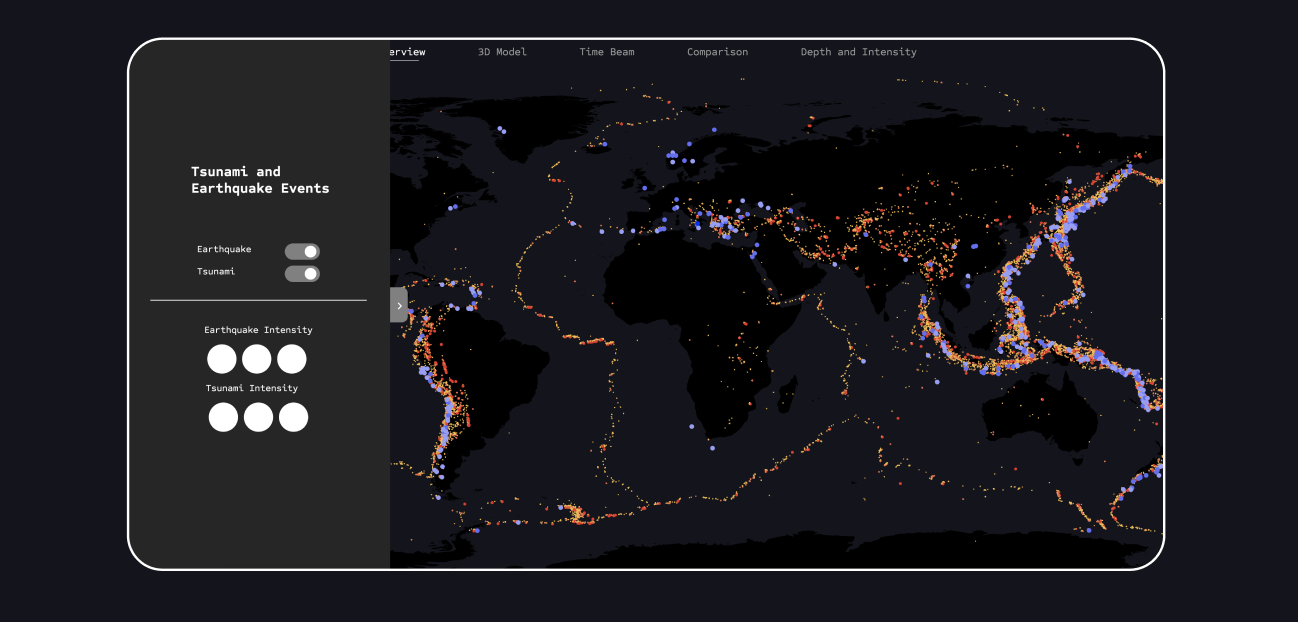
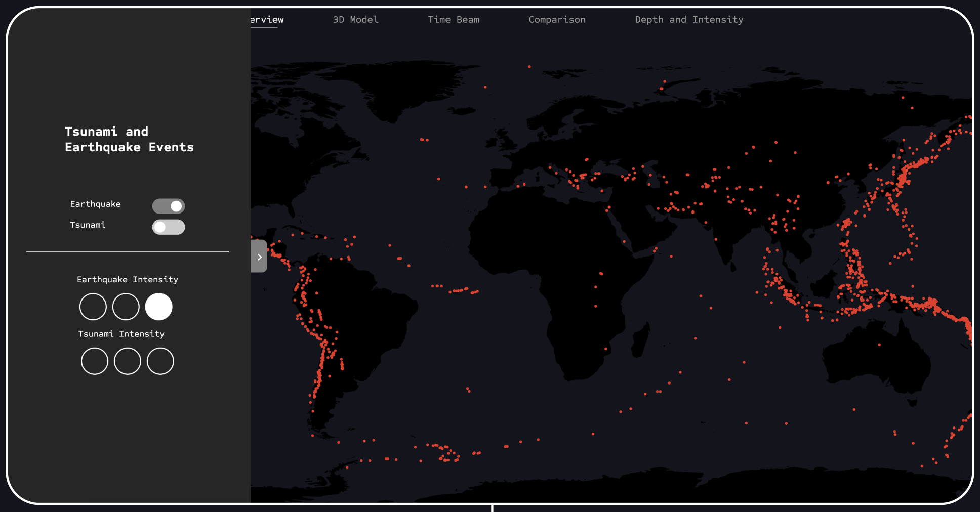
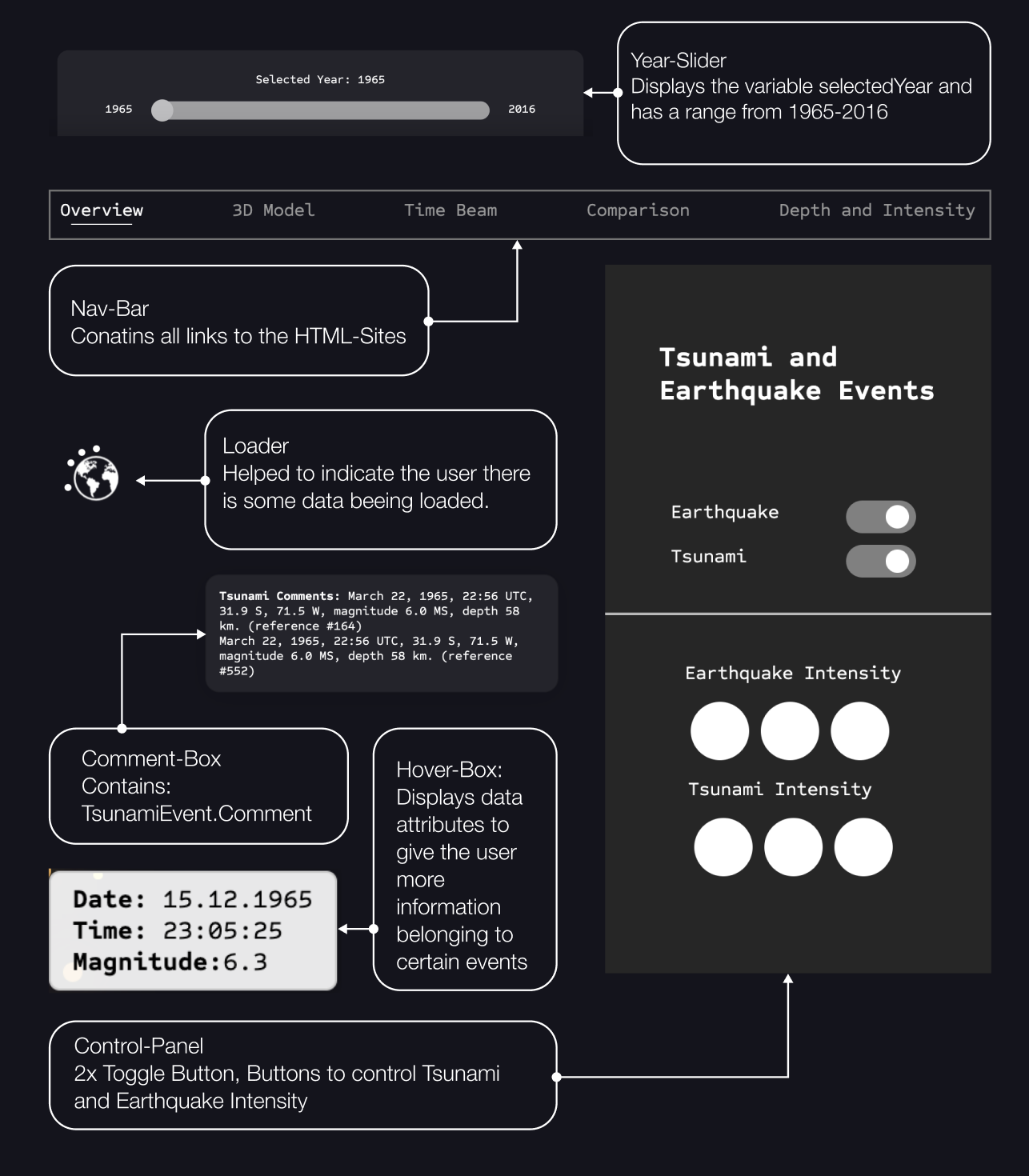
To better visualize and understand the data, the first concepts were developed to incorporate more functional elements into the initial visualization. This included filtering the points into categories, such as by earthquake magnitude. For this visualization, I conceived a control panel that allows toggling the two datasets on and off and filtering by the magnitude of the events.
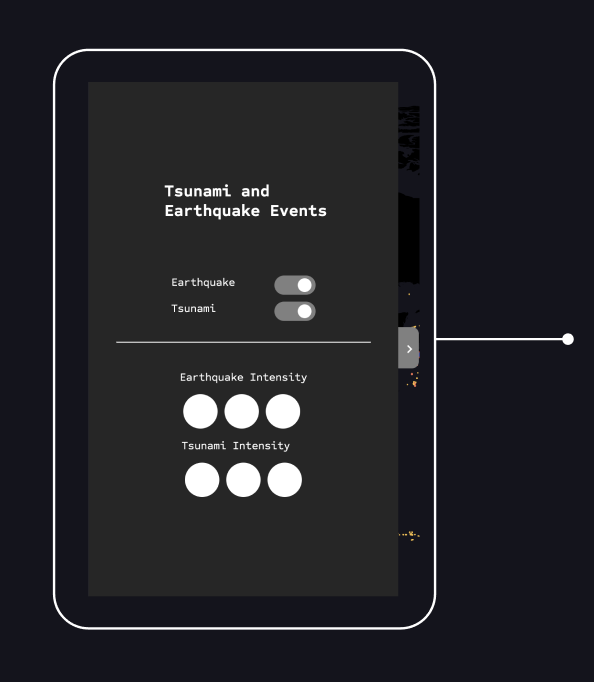
The panel is initially closed to avoid distracting the user when viewing the visualization. It contains two toggle buttons to switch each dataset on and off, as well as a simplified interface to show or hide different intensities.
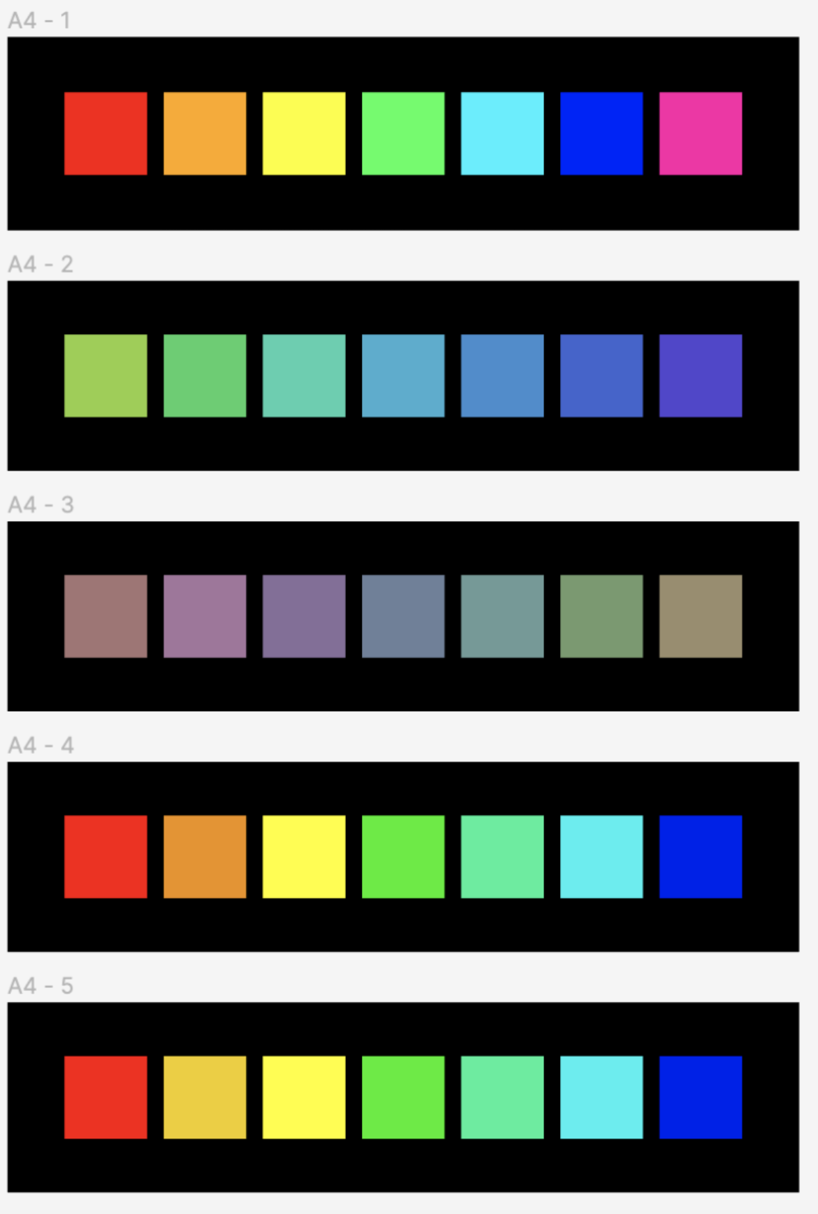
Color
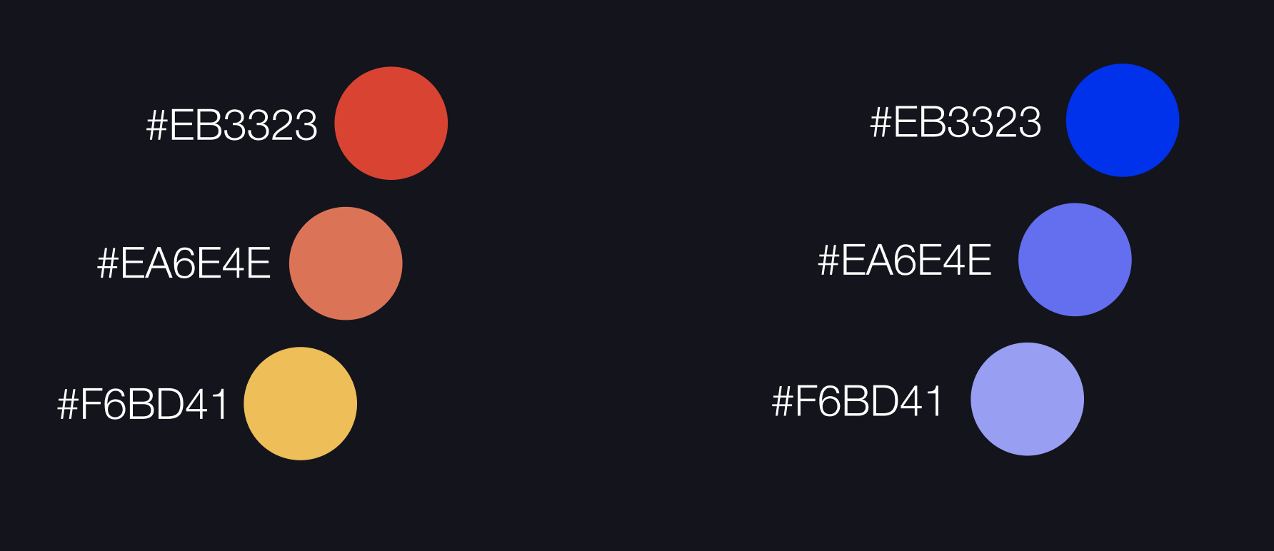
To better distinguish the points, I chose three shades of red for the earthquake points and three shades of blue for the tsunami points.
I continued to use these colors in all subsequent visualization sections to achieve consistency in color representation.
Through this different shading, the viewer can clearly see the distinction between the points. Additionally, I used the different colors to map the magnitude value for earthquake points and to represent the intensity for tsunami points.
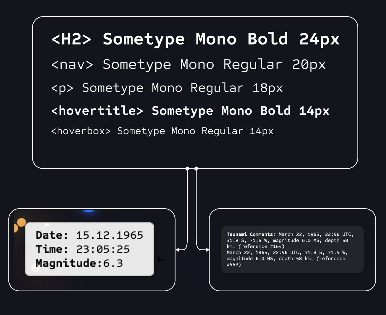
Typografie
I chose SomeType Mono for my data visualization due to its uniform width, which ensures precise alignment of data, and its clear, legible glyphs that minimize character confusion. Additionally, the balanced proportions and modern aesthetics of the typeface enhance both readability and the overall visual appeal of the presentation.
In this project, I tried to avoid text as much as possible to prevent distraction from the visualization and to let it communicate as much as possible on its own. Text was only used for necessary labels, the navigation bar, and button labels, as well as for displaying tsunami events, since they contain stories under the ‘Comment’ value that the user can now discover.
Visualisation Screens
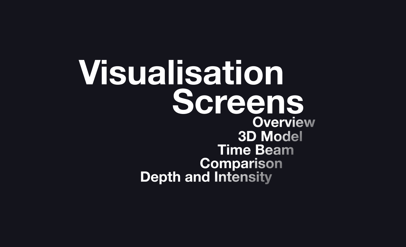
In the following chapters there will be all kind of visualisations beeing displayed.
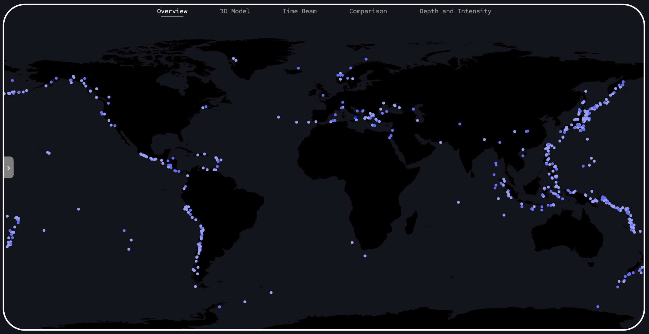
Overview
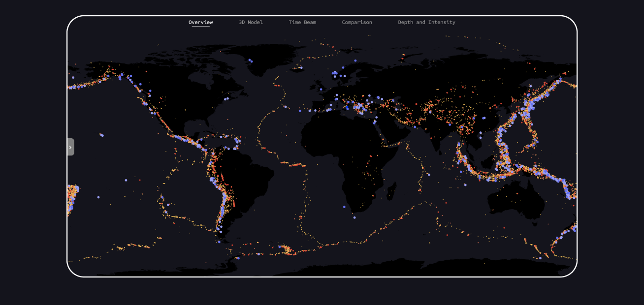
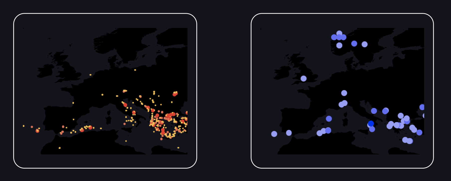
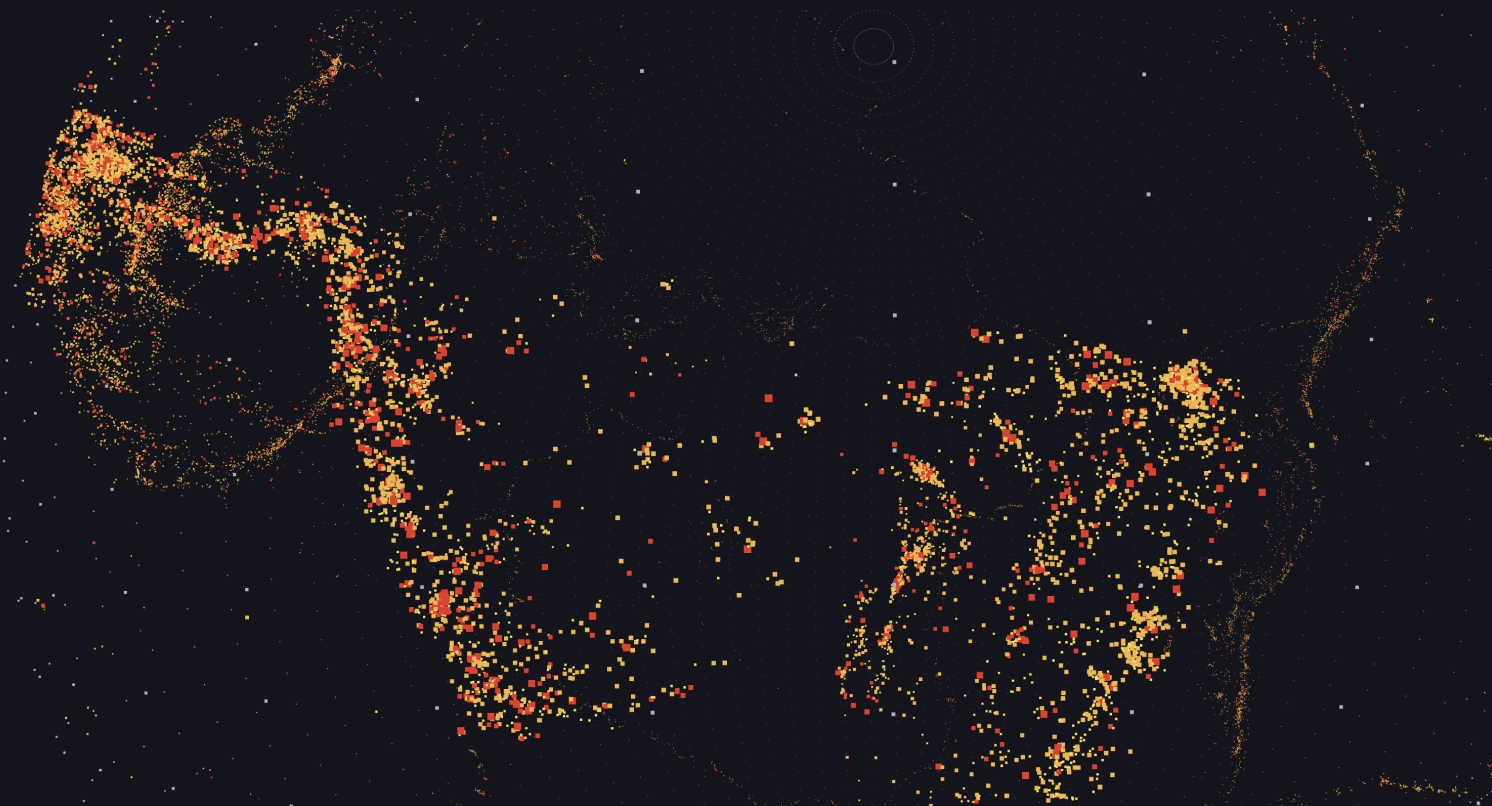
In this section, you can see the landing page with an overview of all data points from both datasets. Blue points represent tsunamis, and red points represent earthquakes. This view serves as a first impression for the user.
When the user opens the control panel, they have various options to manipulate the view, allowing them to reduce the total number of points and focus on a smaller group.
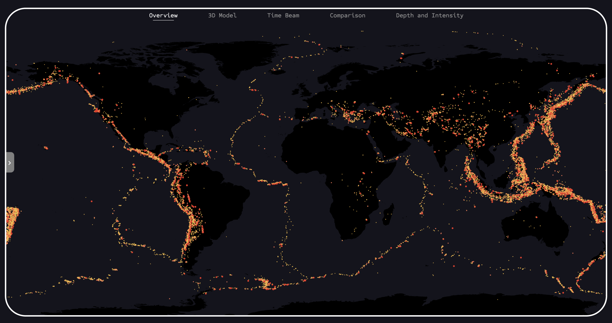
This is an example of a visual representation of all earthquake events contained in the dataset when tsunami events are disabled. In this view, the contours of the individual tectonic plates are clearly visible.
Visualization of the view when all earthquake data points are hidden. It is clear to see that the tsunami dataset is smaller and less extensive.
This view demonstrates the disabled buttons in the panel, indicating that the tsunami points are turned off and only the earthquakes with the highest magnitude are activated. This allows the user to see at a glance where significant earthquakes have occurred on Earth.
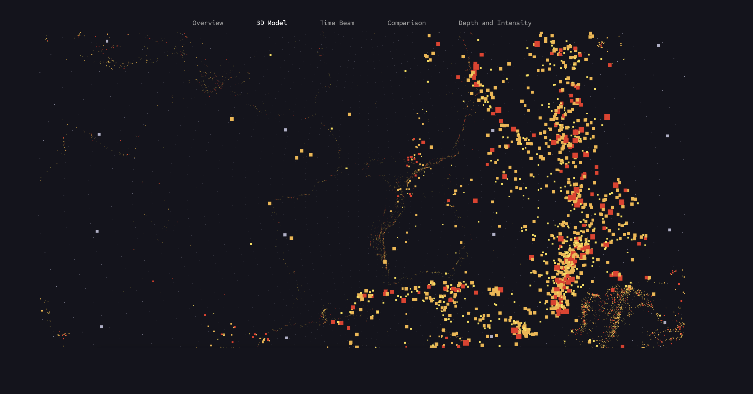
3D Model
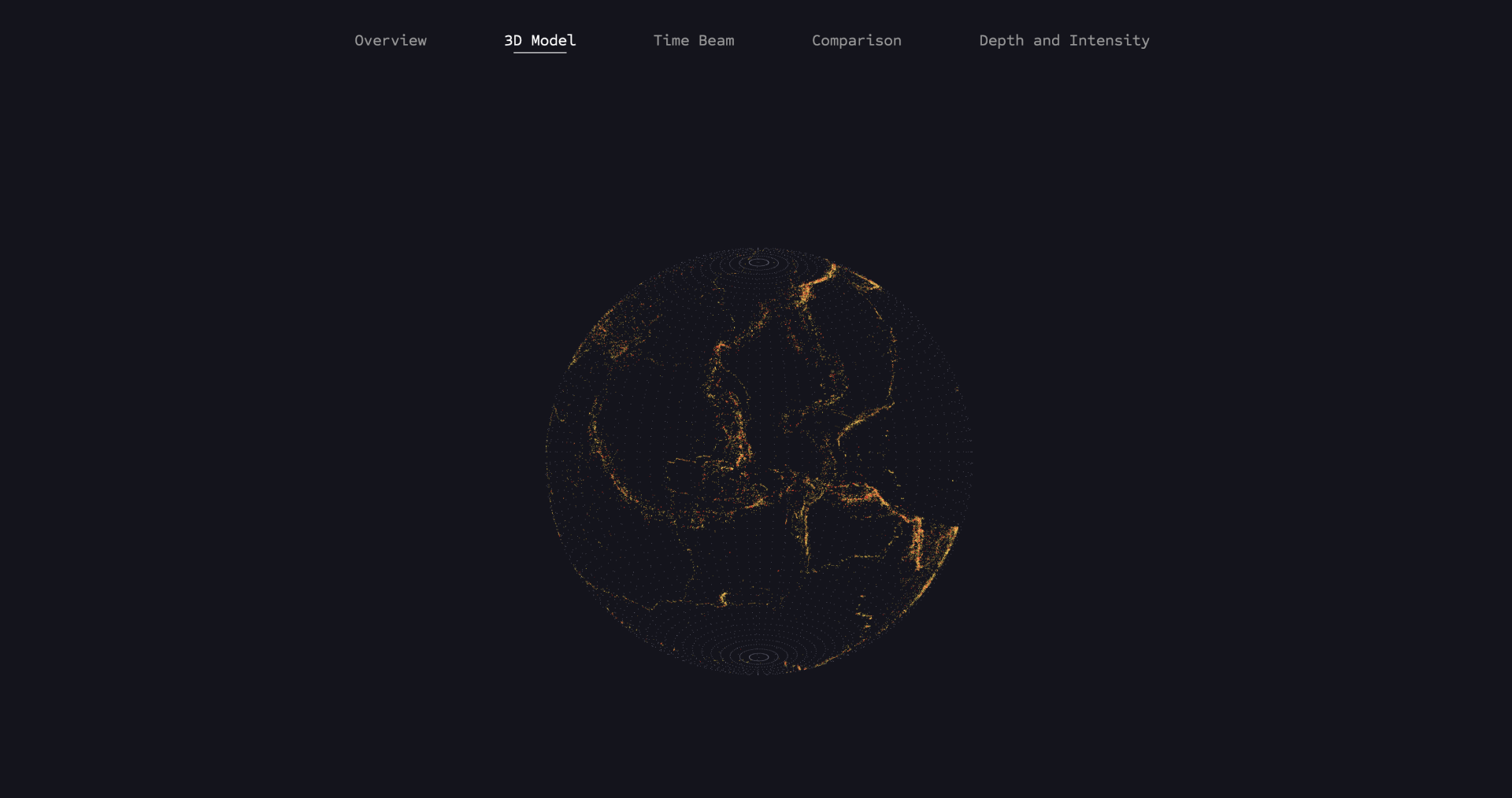
This visualization shows all earthquake data mapped on a 3D globe, taking into account magnitude and depth values. The model was created using Three.js.
The model can be rotated thanks to the THREE.OrbitControls function provided by Three.js. This allows the user to gain a completely new perspective on the data after previously only experiencing it in the 2D model.
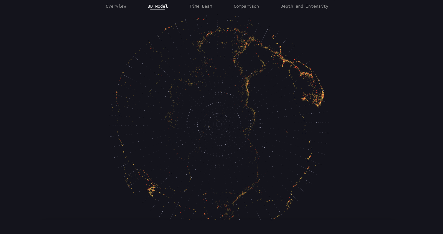
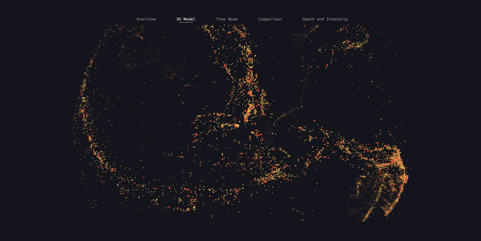
The points are loaded again from the Earthquakes.data dataset and mapped onto the globe based on the longitude and latitude values. Additionally, a magnitude filter function is used again to display earthquakes of different strengths.
The zoom function allows users to interactively explore the depth of earthquakes by zooming into the globe and making the depth visible.
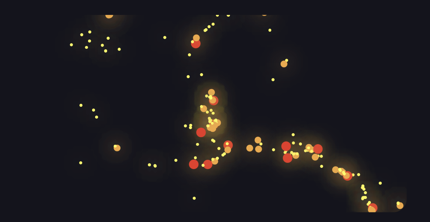
Time Beam
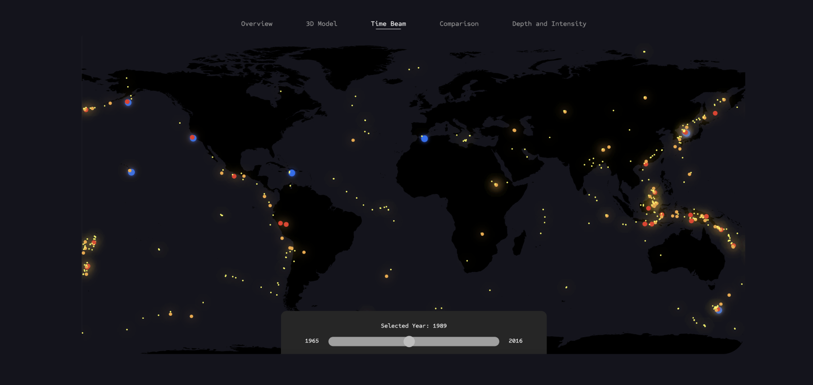
In this visualization, users can reduce the overwhelming amount of information about earthquakes and tsunamis and view the events occurring year by year. This visualization already allows users to discover initial patterns in the data.
By illuminating the points, earthquake hotspots on the Earth can be depicted, providing users with feedback on how the frequency of events can vary depending on location.
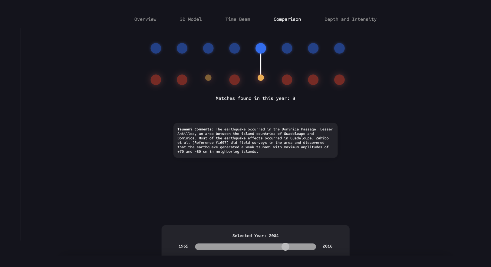
Comparison
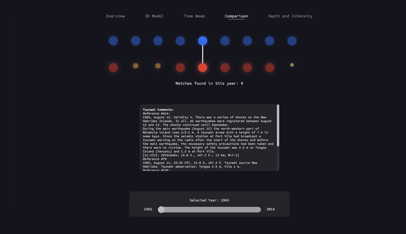
Here, the user can hover over the connections depicted above to directly examine the correlations between an earthquake and the resulting tsunami, and read the story behind this event.
The user is shown the count of all matches registered between the two datasets for each year and can switch between years using the slider.
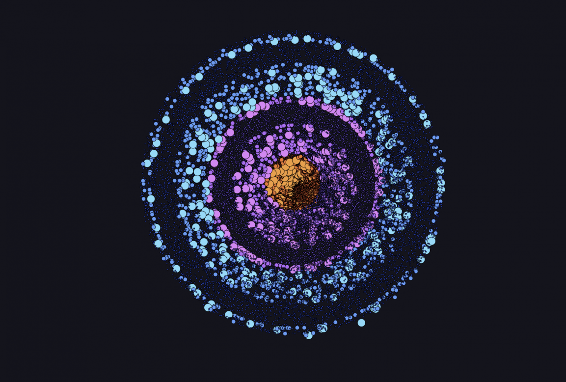
Depth and Intensity
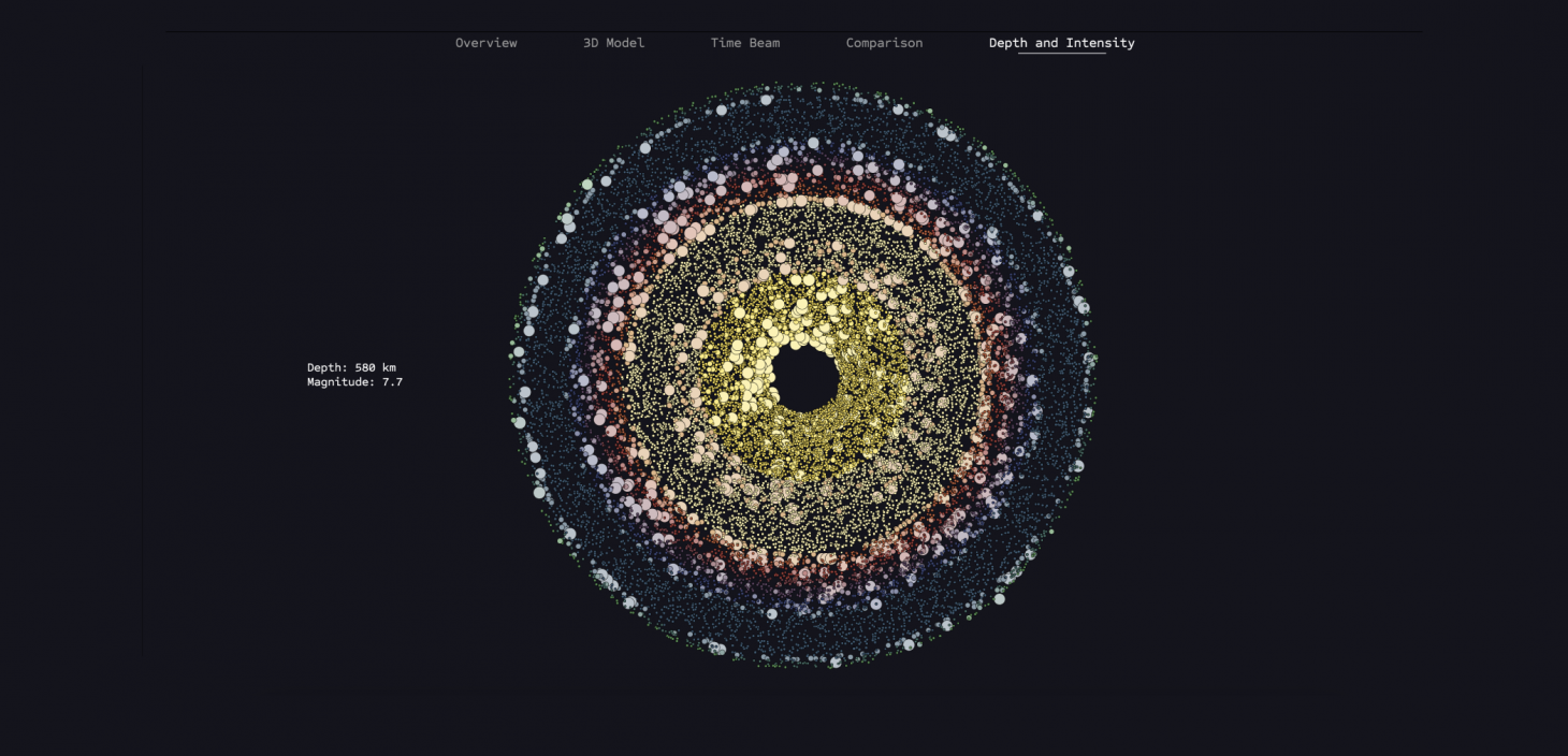
This view visualizes the depth of each earthquake in correlation to its magnitude. The user can hover over each earthquake to display its strength and depth.
The colors are intended to enhance understanding of depth. Green represents the surface, and warmer colors represent the deeper layers of the Earth’s core. The colors in the lower example were generated from a color experiment but were not chosen due to the lack of classification.
Results
Now I come to my own results, which have caused me problems during this project, but also to the interesting findings that emerged in the process. The different formatting of the individual datasets made it very difficult for me at the beginning to verify the completeness and accuracy of the datasets, as it was very important to me that the visualization was based on actually logical data. One difficulty was that the datasets were of different sizes: there were 24,000 earthquake events but only 2,000 tsunami events, and I was concerned that I would not find any data that could be confirmed as related.
My initial hypothesis that tsunamis are correlated with earthquakes was confirmed for over 400 events, as both the geographical locations and the temporal data of the events could be unambiguously matched. There were partially incomplete intensity entries in the tsunami dataset, but these were identified and excluded from the comparison, ensuring that all data points visible in this visualization consist of complete elements from the datasets. A clear correlation between earthquakes and tsunamis from two different datasets was established. Additionally, it is worth noting that only significantly strong earthquakes generally triggered tsunamis. In this dataset, less than 3% of earthquakes with a magnitude less than 6 triggered tsunamis.
Code Snippets

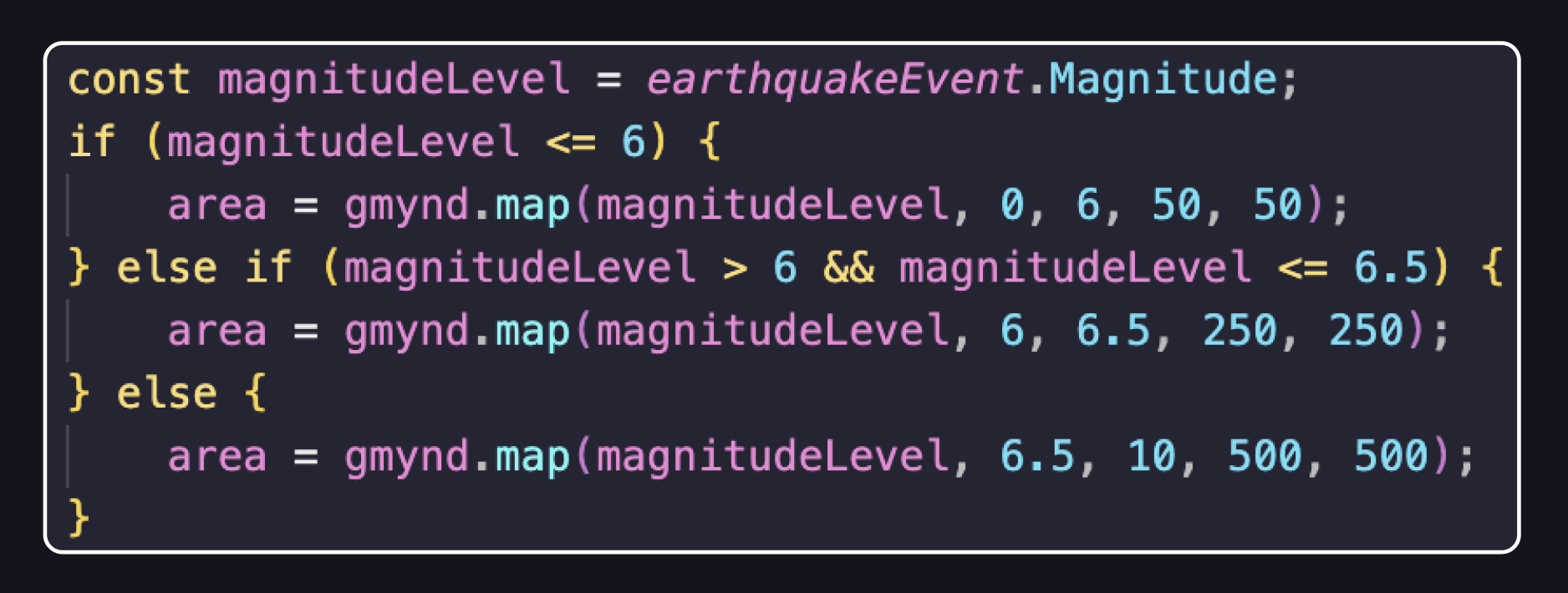
This code demonstrates how the size of the drawn dots is generated based on the magnitude level. Major earthquakes are drawn larger on the map, while moderate and smaller earthquakes are drawn smaller.
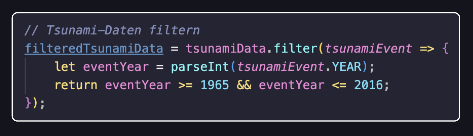
In this code section, the limitation of the tsunami dataset was carried out. Since the earthquake dataset only contained data from 1965 to 2016, while the tsunami dataset included data from -1000 to 2020, this function allowed the extraction of essential data from the dataset.
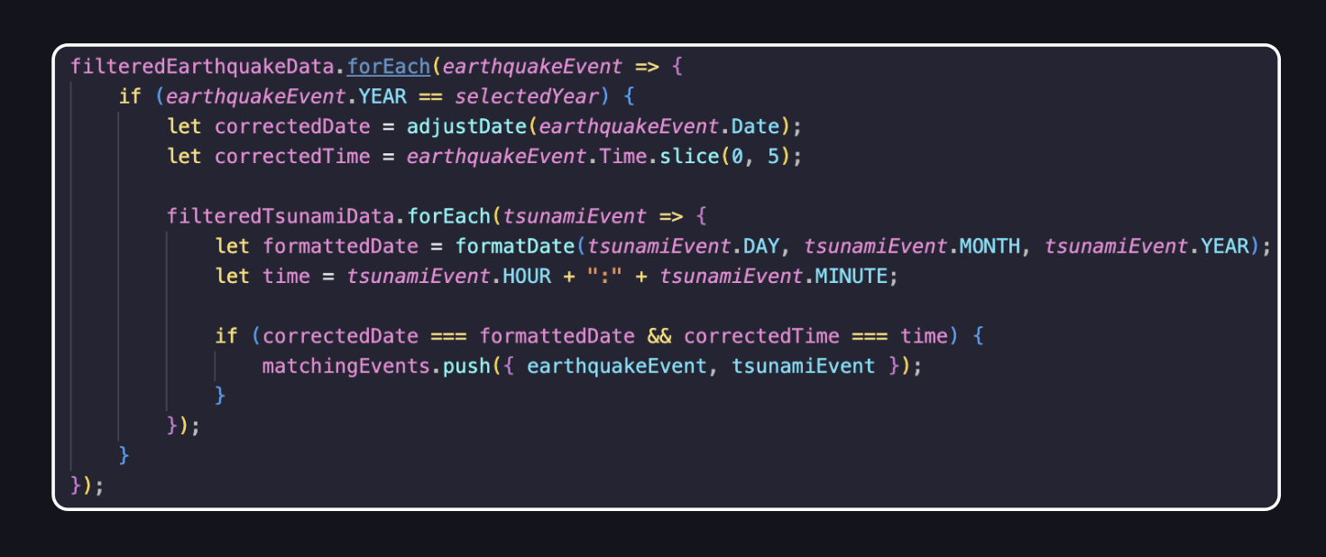
This code demonstrates the solution that ultimately led to matching earthquakes with tsunamis. It consists of a nested forEach loop, where the outer loop iterates over the earthquake events in the dataset, and the inner forEach loop iterates over the tsunami events. This way, every possible combination of earthquake and tsunami events is checked to see if they occurred at the same time. Finally, all found matches are stored in the list matchingEvents.
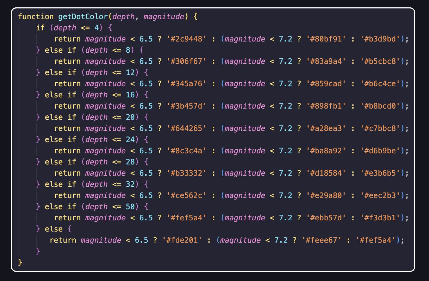
This code shows how I incorporated color gradients in the depth-intensity representation. Yes, there’s a switch-case loop. ;-D
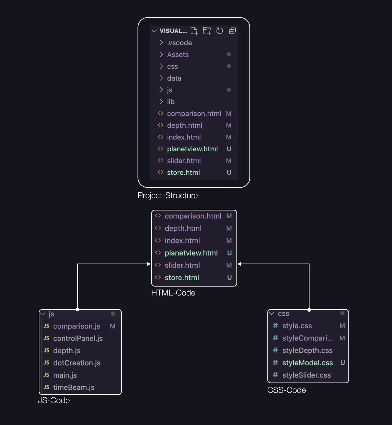
Project Structure
Design Assets
Semester Drawings
Farbsensibilisierung