design
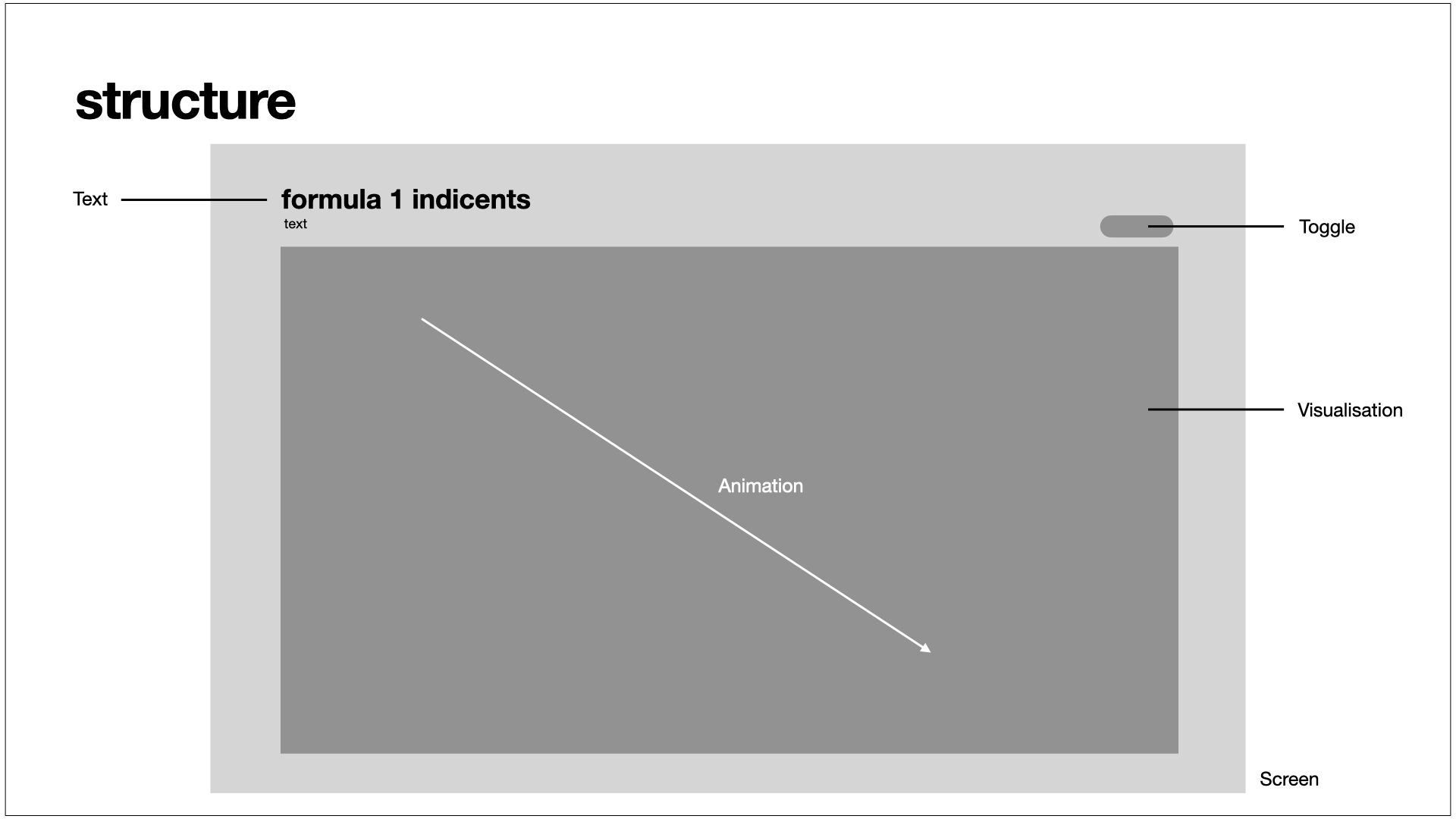
The layout has hardly changed over time. The visualisation is still in the centre and the label at the top left remains unchanged. The toggle button was eventually moved to the top right corner to give the visualisation more space; this area was previously free. Later, an animation was added to the second screen that runs from left to right. This animation should display the depth and number of individual statuses. The more statuses there are in the respective areas, the longer the animation lasts.
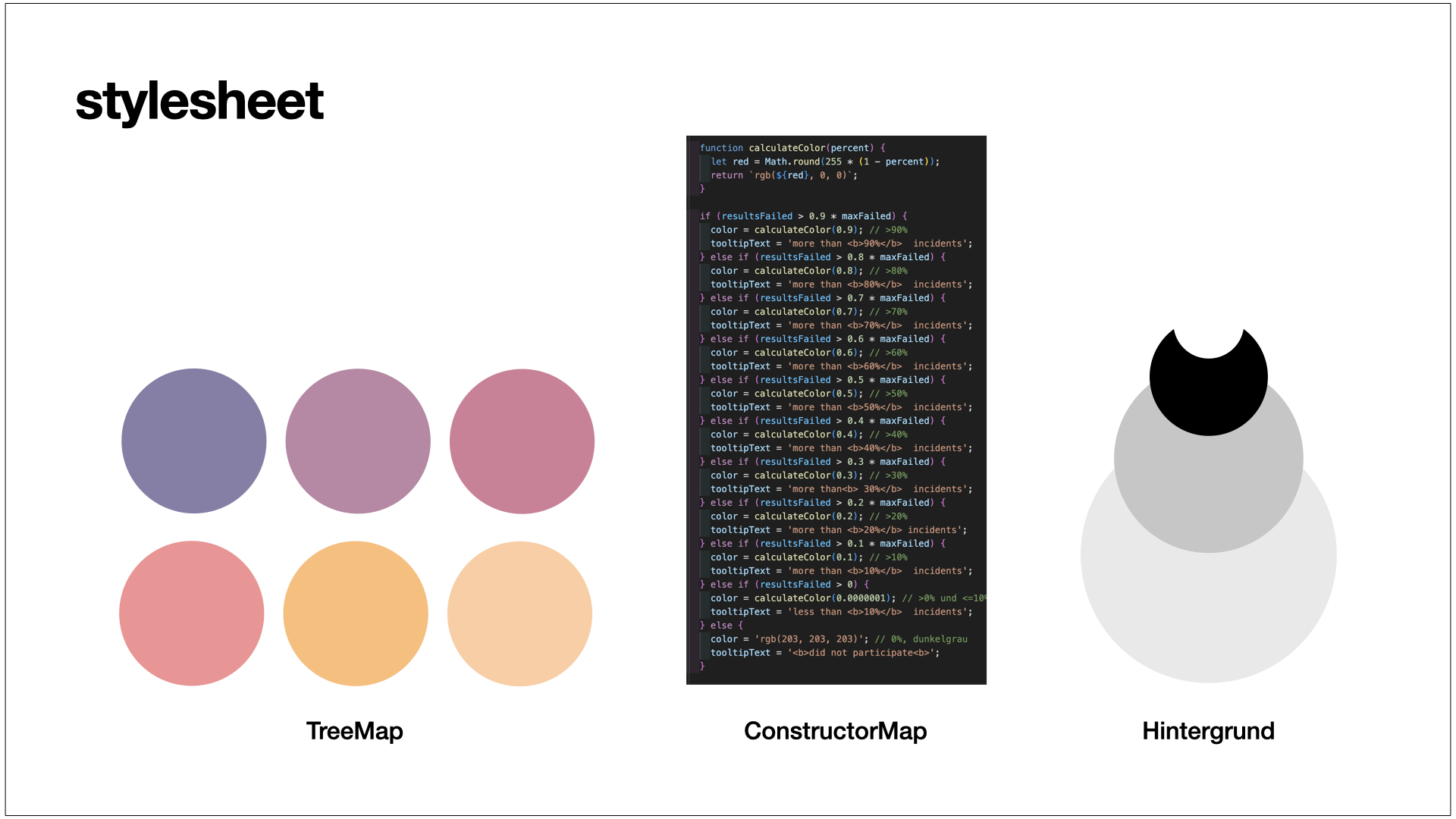
On the first screen, the colours are generated by a generator using “red” as the base colour. The intensity of the colour varies depending on the number of statuses occurring in this time frame; the more statuses there are, the brighter the colour is displayed.
To create a clear differentiation from the first screen, the colour scheme for the second screen is purple to yellow. Each area has its own colour.
The background is grey to provide a contrast.