Variants during process
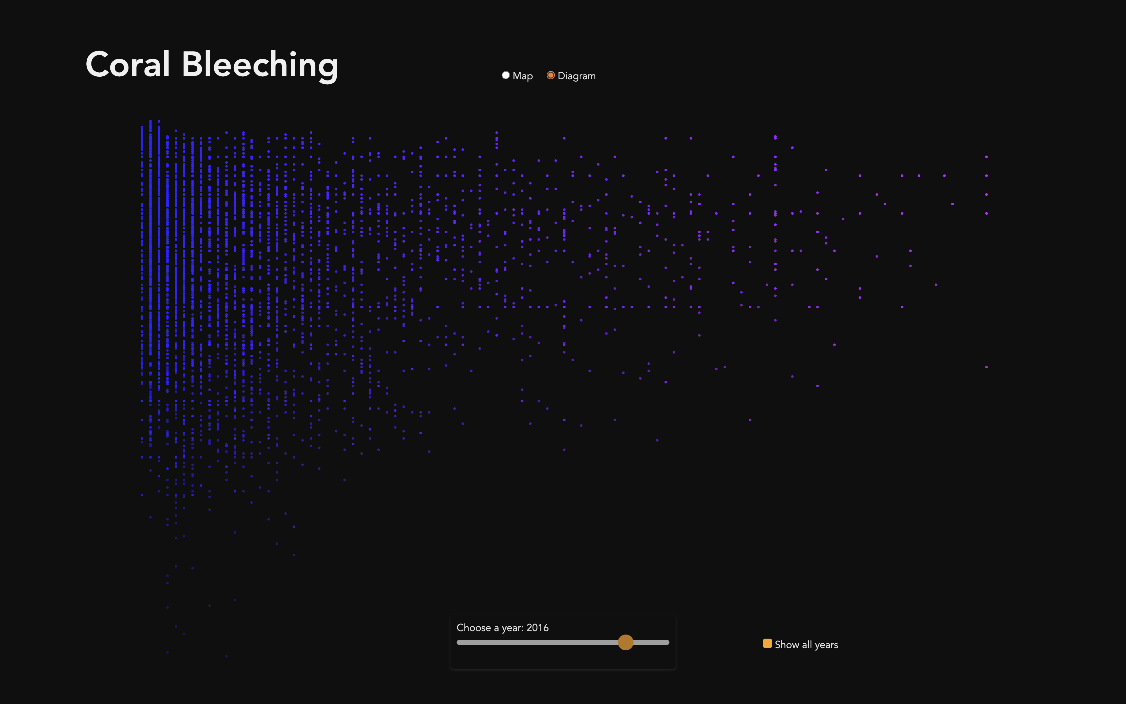
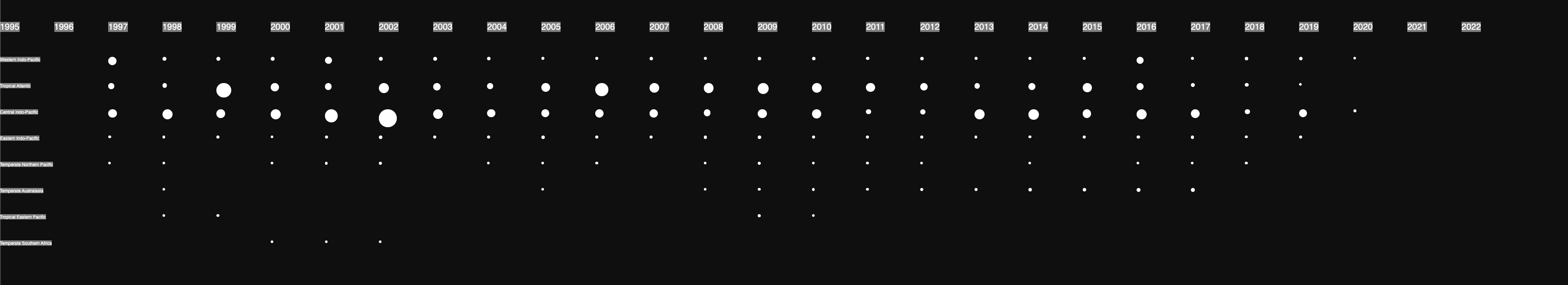
At first i started to draw some bar charts to visualize my data and check them for amount and completeness. There i realized some difficulties that i have not considered in my visual concept so far. It turned out that a lot of years have pretty incomplete data, especially if you sort the data as realms, which are seven regions all around the world. You can see that some of them like Tropical Eastern Pacific(second last one) and Temperate Southern Africa(last one) are just documented in a few years.
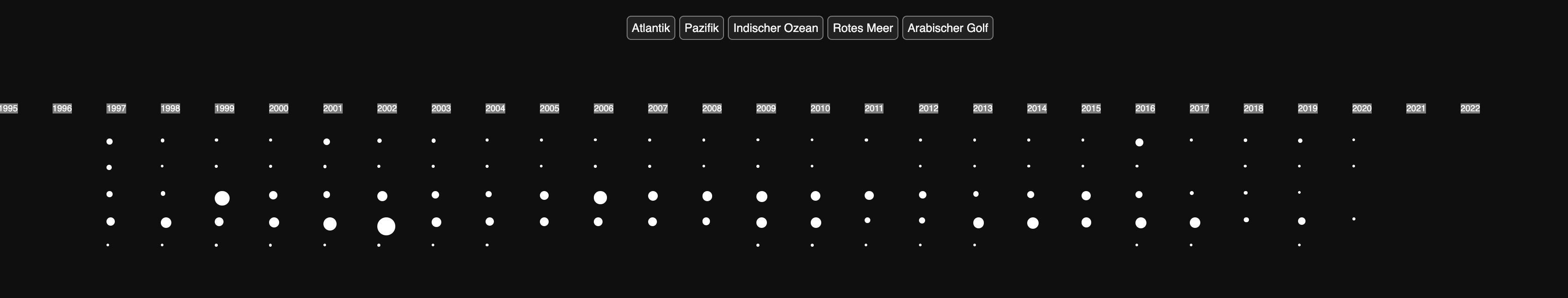
Then i tried to sort the data to the five existing oceans and it looked a bit better but i still had a lot of missing data, especially if i chose one specific year. In some years not even all oceans are documented.
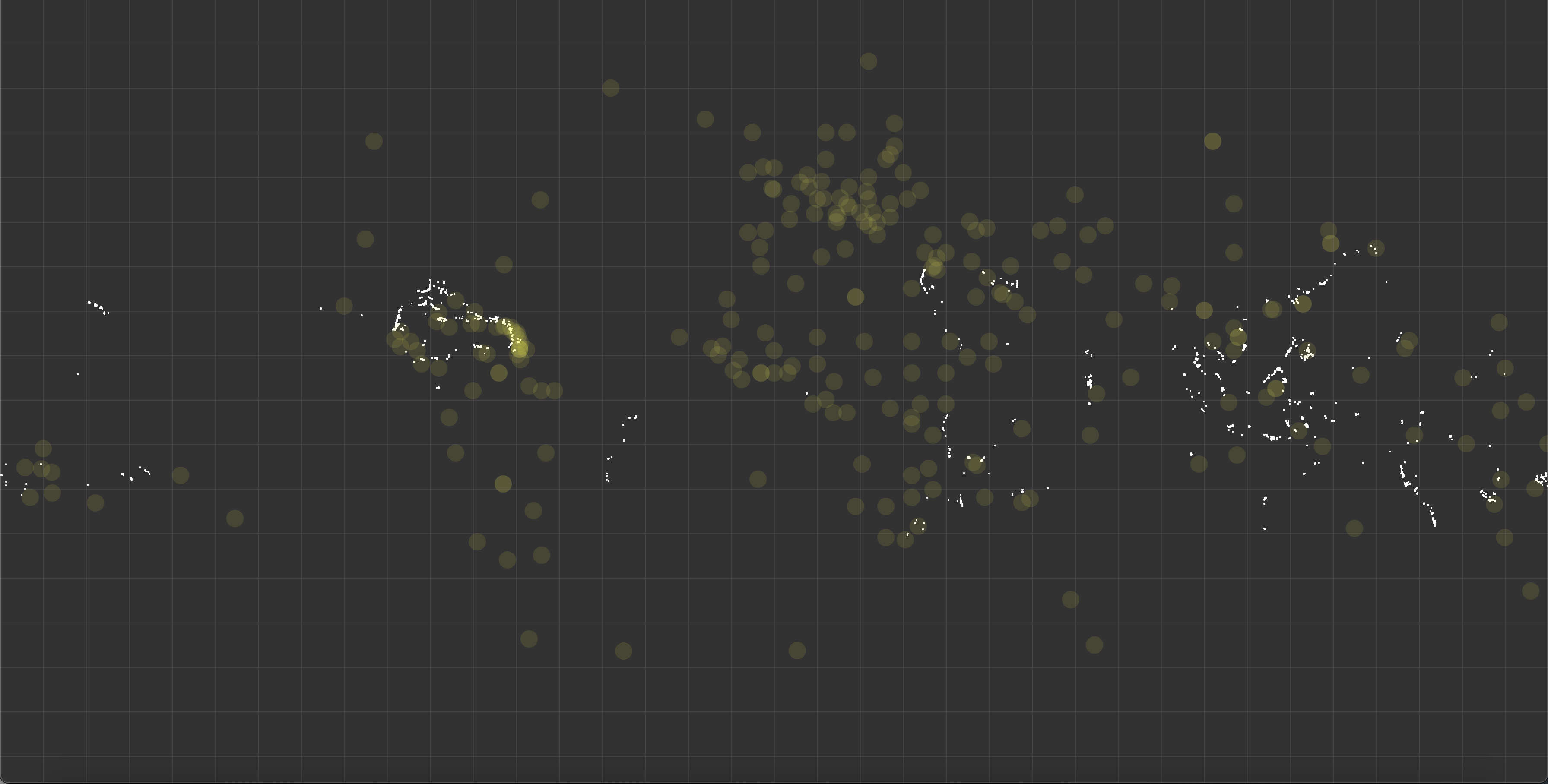
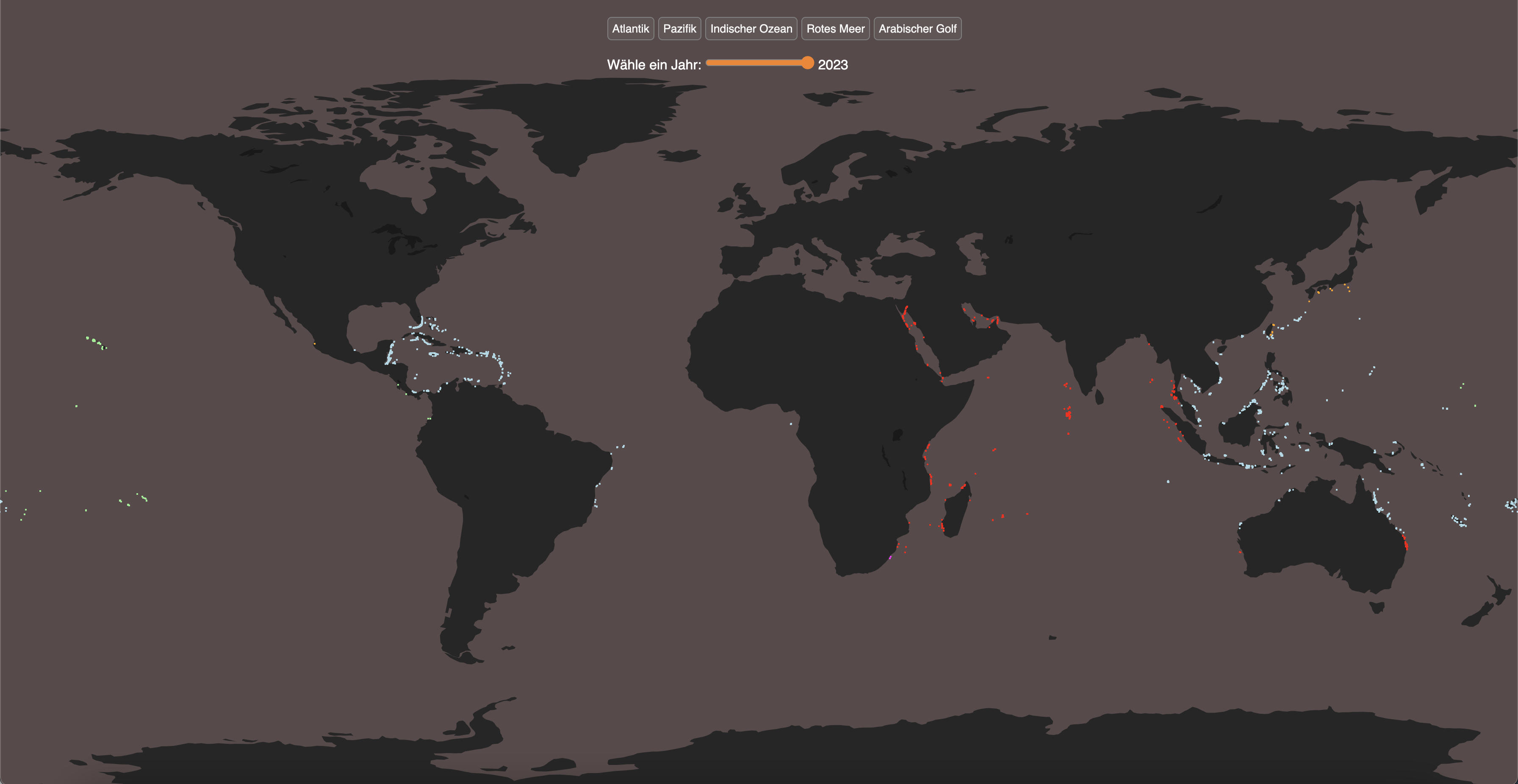
So i started to put all the dots on a map and added some yellow dots to get some orientation with nearby countries.
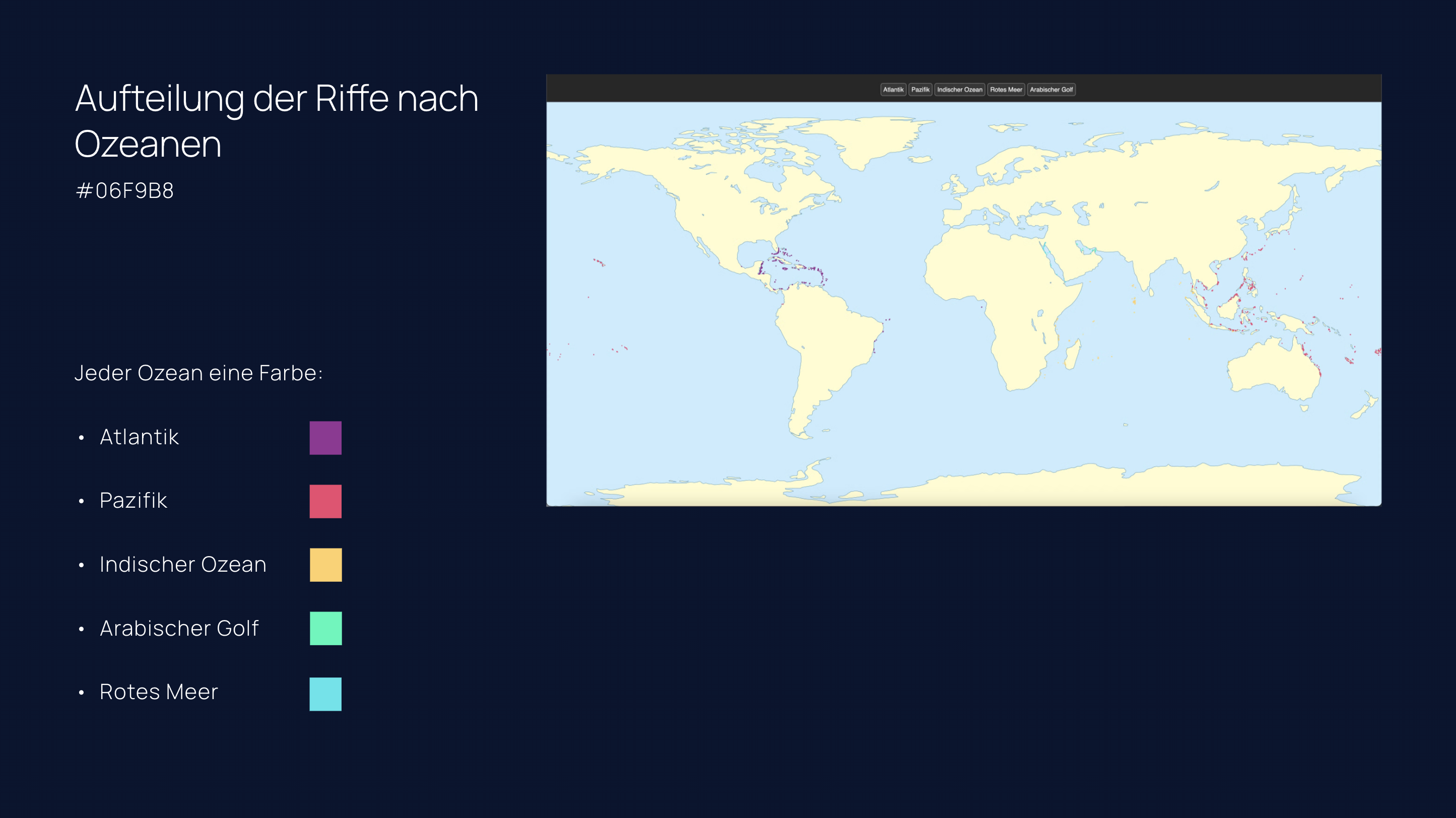
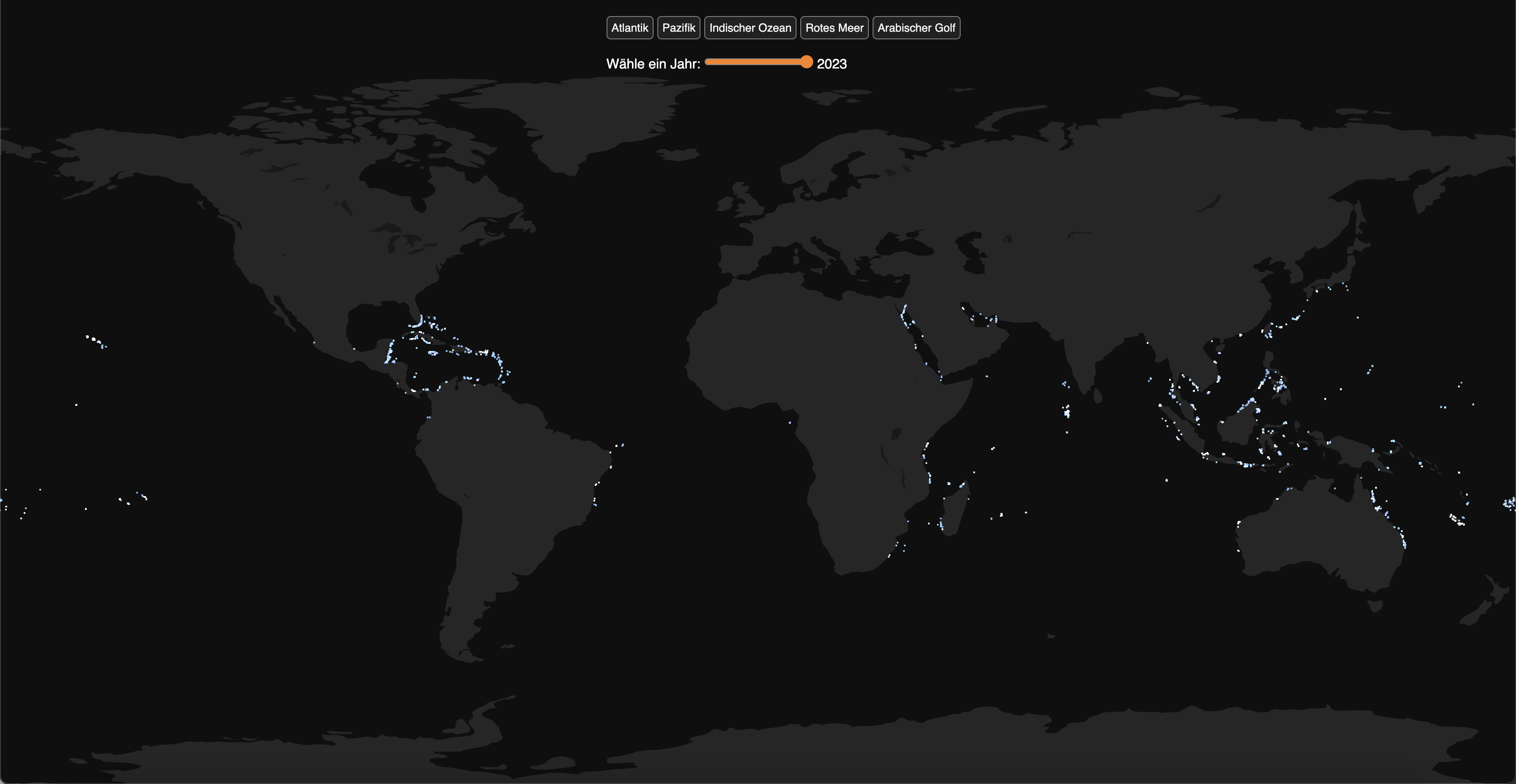
Later i added a real map and made some variation with color before i settled towards my final really dark grey theme. At those maps i also grouped the data by oceans which i later changed to the bleaching percent, because you can already see where they are located.
Here i tried to also visualize the depth of the reefs on a map.
But since the difference is hard to spot i made this a scatter plot with an increasing opacity for the depth(on black Background the dots get darker the deeper they are) and an increasing red value for more bleaching to alarm the user.